If you can’t look away from the climbing case counts, look here. A visualization site called 91-DIVOC provides graphs of the epidemic curve, comparing countries, and allowing you to see them on either a linear or logarithmic scale.

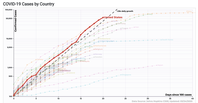
If you can’t look away from the climbing case counts, look here. A visualization site called 91-DIVOC provides graphs of the epidemic curve, comparing countries, and allowing you to see them on either a linear or logarithmic scale.
0 comments :
Post a Comment